Sunday, 6 March 2011

Warriors of Rock Music Magazine front cover


This is my Music Magazine front cover which is called "Warriors of Rock" I have included the following features in which all Music Magazines should have:

  • Clear Masthead
  • Centeral Dominant Image (C.D.I)
  • Puff
  • Bar Code and date
  • Price of Magazine
  • Clear text layout
  • Website
  • Free gift
  • Frequency (weekly, monthly)

Thursday, 3 March 2011

My music magazine with the chosen image on the cover

This is what my Music Magazine front cover looks like so far. It has a Centeral Dominant Image, Bar Code, website and a Strapline

I am planning to use "Blazed" font which is from Da Font.com . This would be good for the Target Audience because the font would tie in with the Genre which is Rock and Roll

Idea of what my music magazine would look like.

This is a plan of what my music magazine woud look like. I have included the following features which a typical magazine should have:

  • Mast head
  • Strapline
  • Puff
  • Centeral Dominant Image (C.D.I)
  • Bar Code
  • Competition offer

Sunday, 27 February 2011

The 7 photos which I have chosen to use for my magazine


These are the 7 photos which I have chosen to use for my Magazine. I have also decided that I am going to edit them to make the photos just right.
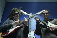
I am also going to use the crossed guitar photo as my Central Dominant Image on my front cover accompanied by some smaller shots. I think that using this technique, I am hoping that the Target Audience will be able to see that this is a Rock magazine due to the images on the front cover and they would stand out to attract the reader’s attention.

All Origional Photography for Rock Magazine


These are all of the 16 photos which I have taken over Half Term for my music magazine which is called “Warriors of Rock”. All these photos are original and are relevant to my magazine because all my images are to do with rock.
Also the reason why I have chosen these particular photos is because my magazine Target Audience could look at these photos and think to themselves “I could release my inner rock child”.

Sunday, 6 February 2011

Pre Lim task School Magazine contents page

This is my Pre lim task which was create a School Magazine contents page. All of the images were taken by me.

The background is light orange because it goes well with the House Style which is Blue and Red and makes the colours stand out and it is also easy to read and also for the Target Audience to understand.

I have included 8 images in my contents page which have been edited using Photoshop.

This contents page was created in Adobe Photoshop 6.0

Thursday, 27 January 2011

Deconstructing a Men’s Lifestyle magazine contents page (FHM)

 
House Style

The house style for this contents page is black title with orange writing. The reason why the editor has used black and orange is because the colours both symbolises lust for the magazine. This is good for the Target Audience because they can be interested in the magazine contents page because they would want to find out what the magazine contains.

Use of images

In FHM, the contents page the editor has used a variety of images to get the Target Audiences attention. The reason why the editor has used a variety of images is so that the Male Target Audience can be reflected and or summed up in those images.

Logo

FHM contains no magazine logo in their contents page

Use of Language to get audience attention

There is a use of persuasive language and speech which involves the First Person. This skill used in the magazine would make the Target Audience feel like they are being talked to through the use of this magazine. This is a good because it would guarantee a readership from every issue sold.


Font

The font stands out because that is a title for each of the different categories mentioned in the contents page.