Here is the link to my Warriors of Rock Evaluation.
http://www.scribd.com/doc/53725230/Media-Evaluation-on-Warriors-of-Rock
Sunday, 24 April 2011
Thursday, 31 March 2011
What I am Going to use for my magazine Evaluation.
I have decided that I am going to use Scribd rather than Prezi to upload my Evaluation on my Magazine. this is because it is simple to navigate and easy to use. I am going to do my evaluation using Microsoft Powerpoint 2007 before I upload the presentation.
Sunday, 27 March 2011
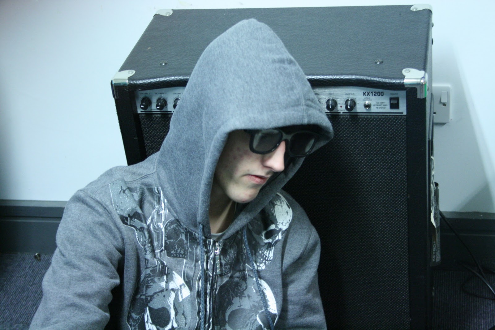
Warriors of Rock D.P.S
This is my Media Magazine D.P.S
The D.P.S is different to all the other pages because it has a Centeral Dominant Image on one page and text which connotates the image on the second page.
I have chosen the following image for my D.P.S because the D.P.S is about my band called "Thunderbolt" and they consist of 2 people.


The D.P.S is different to all the other pages because it has a Centeral Dominant Image on one page and text which connotates the image on the second page.
I have chosen the following image for my D.P.S because the D.P.S is about my band called "Thunderbolt" and they consist of 2 people.
I have also used the "Blazed" font for my masthead because the font makes the writing stand out from the rest of it. I have also included a website link so that the Target Audience can read the rest of the story about "Thunderbolt" and I have also included a Facebook page as well so the Target Audience could "Like" the page and by doing so, the magazine would send the Target Audience information about the magazine in general but also the bands and free tracks as well.
Friday, 25 March 2011
Mood Board for Warriors of Rock
Here is my Mood Board to represent the Target Audience for Warriors of Rock.
 As you can see, all of my images used connotate the Target Audience for my Magazine.

Wednesday, 23 March 2011
Media DPS Practice

This is my practice of my DPS. It contains the following:
- Mast Head.
- Centeral Dominant Image
- Website
- Page number
- Text with quotations
Sunday, 13 March 2011
Warriors of Rock Music Magazine Contents Page
 This is my Media Music Magazine Contents Page. In the contents page, I have included the following features:
- Clear Mast Head
- Images
- Subscription Offers
- Puffs
- Editors note (Letter)
Thursday, 10 March 2011
Warriors of Rock practice Contents Page

- Mast Head
- Images
- Promotion
- Text
Also the images I am going to use going down the side I have got the idea from FHM.
Sunday, 6 March 2011
Warriors of Rock Music Magazine front cover

This is my Music Magazine front cover which is called "Warriors of Rock" I have included the following features in which all Music Magazines should have:
- Clear Masthead
- Centeral Dominant Image (C.D.I)
- Puff
- Bar Code and date
- Price of Magazine
- Clear text layout
- Website
- Free gift
- Frequency (weekly, monthly)
Thursday, 3 March 2011
My music magazine with the chosen image on the cover

I am planning to use "Blazed" font which is from Da Font.com . This would be good for the Target Audience because the font would tie in with the Genre which is Rock and Roll
Idea of what my music magazine would look like.

- Mast head
- Strapline
- Puff
- Centeral Dominant Image (C.D.I)
- Bar Code
- Competition offer
Sunday, 27 February 2011
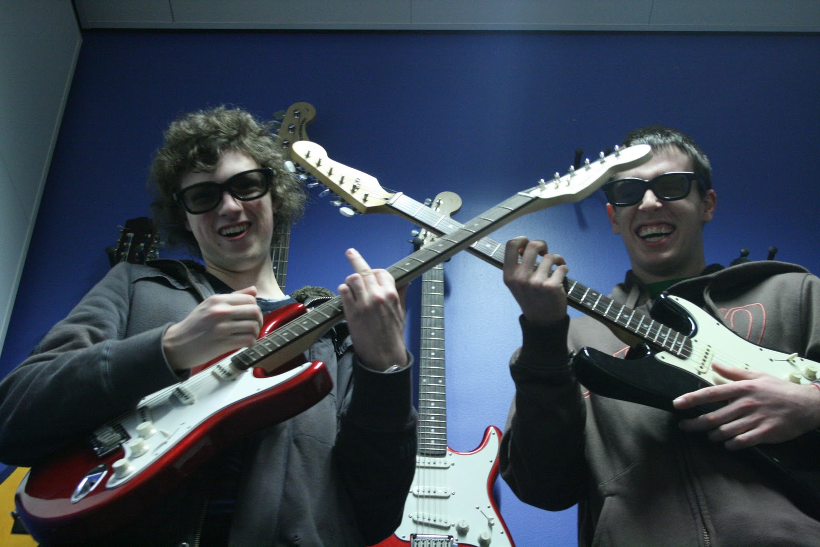
The 7 photos which I have chosen to use for my magazine


These are the 7 photos which I have chosen to use for my Magazine. I have also decided that I am going to edit them to make the photos just right.
I am also going to use the crossed guitar photo as my Central Dominant Image on my front cover accompanied by some smaller shots. I think that using this technique, I am hoping that the Target Audience will be able to see that this is a Rock magazine due to the images on the front cover and they would stand out to attract the reader’s attention.
All Origional Photography for Rock Magazine
These are all of the 16 photos which I have taken over Half Term for my music magazine which is called “Warriors of Rock”. All these photos are original and are relevant to my magazine because all my images are to do with rock.


Also the reason why I have chosen these particular photos is because my magazine Target Audience could look at these photos and think to themselves “I could release my inner rock child”.
Sunday, 6 February 2011
Pre Lim task School Magazine contents page

The background is light orange because it goes well with the House Style which is Blue and Red and makes the colours stand out and it is also easy to read and also for the Target Audience to understand.
I have included 8 images in my contents page which have been edited using Photoshop.
This contents page was created in Adobe Photoshop 6.0
Thursday, 27 January 2011
Deconstructing a Men’s Lifestyle magazine contents page (FHM)

House Style
The house style for this contents page is black title with orange writing. The reason why the editor has used black and orange is because the colours both symbolises lust for the magazine. This is good for the Target Audience because they can be interested in the magazine contents page because they would want to find out what the magazine contains.
Use of images
In FHM, the contents page the editor has used a variety of images to get the Target Audiences attention. The reason why the editor has used a variety of images is so that the Male Target Audience can be reflected and or summed up in those images.
Logo
FHM contains no magazine logo in their contents page
Use of Language to get audience attention
There is a use of persuasive language and speech which involves the First Person. This skill used in the magazine would make the Target Audience feel like they are being talked to through the use of this magazine. This is a good because it would guarantee a readership from every issue sold.
Font
The font stands out because that is a title for each of the different categories mentioned in the contents page.

Wednesday, 26 January 2011
Analysis of Contents Page for Prima Magaine (Womans Lifestyle)

House Style.
The colour of contents page is black text with a red subheading to separate the titles from text. The colours black and red represent important information because of the size of the writing attracts the Woman’s market because when they read this magazine, they would feel that they would want to aspire to be the person in the magazine and they would want to know where they could get the equivilant of what is in the magazine without the celebrity price tag.
Use of Images
The contents page for Prima Magazine uses a whole range of different images to capture the Target Audiences attention. This is also known as a U.S.P this would guarantee readership as well as the cover as well. This is because it depends on the cover of the magazine.
Use of Logo
The Prima contents pages feature no logos to comment on.
Use of Language to get attention
The Contents page uses a variety of languages to get the audiences attention. The contents pages uses persuasive language to get their audiences attention. This is achieved by the editor putting words and phrases such as “Get a 12 month magazine subscription for the price of 10.” This attracts the Target Audience because they would be interested in this magazine and they would subscribe because they may find a free gift.
Colour scheme
The colour scheme used with the Prima contents page is basic. This is because the main colour scheme for the font is red title with black writing. This is good for the Woman’s market because they like to look and also decide to take in the images and read all the little bits of detail which the contents page has to offer. Also in the top right hand corner, I notice that the free gift page appeals to the Woman’s market because Prima is a Woman’s lifestyle magazine which contains all the latest gossip about different fashion trends and how to cook different foods.
Connotations of picture
The pictures within the Prima display what a woman wants to feel like. They also aspire to be that particular person on the front cover of the magazine and also displayed because they look manly to the target audience and they would feel the freedom in which the magazine would have to offer.
How would the Audience respond?
The Target Audience would respond well to the whole layout with the pictures. This is because when they would want to see the images. This is because they would feel young again due to the image and what the true meaning of this image is.
Thursday, 6 January 2011
Q contents page analysis

House Style
The house style for this is that the editor has used red. This symbolises lust for the magazine. This is good for the Target Audience because they can be interested in the magazine contents page.
Use of images
In the Q contents page the editor has used CDI. This is good for the Target Audience because they can read the contents page and they would see the CDI which is big and bold because it would make the magazine stand out and it is a U.S.P
Logo
There is a Q magazine Logo in the top left hand corner.
Use of Language to get audience attention
There is a use of persuasive language because there is a short fact file for each of the artists mentioned in the contents page. This is good because the Target Audience can learn about the artist in detail.
Font
The font stands out because that is a title for each of the artists mentioned in the contents page.
Q Double Page Spread analysis

Title
The title for the Double Page Spread is called “Bad Company”. This is a good title for the Target Audience because they would be attracted to the big bold title which takes up most of the page.
Colour
Q magazine uses a range of colours for their Double Page spread. This is because they want the page to be colourful such as red for the quotes and the Band names. This would attract the Target Audience because they are interested in bright colours such as red, gold and Black.
Font
The font is small because there is a lot of information to put into the page. This would attract the Target Audience because they may be interested in bands such as Guns and Roses.
Why does it appeal to the audience?
The double page spread would attract audiences because they would be aged between 20 – 30 and they would be attracted to all time great music. Also there is an image of Guns and Roses which would appeal to the Target Audience.
Images
There is a wide range of images used within this Double Page Spread. The images are big and bold because the target audience would like to see the band and they are a fan of Guns and Roses.
Design Features
There are no design features to comment on.
Classic Rock Double Page Spread

Title
The title of this double page spread is called “DR. John”. The way in which the title is laid out is that the title takes up ¾ of the page. This is because the Target Audience would want to see what the double page spread is about and they would also want to know who “DR. John” is.
Colour
The colour of this article is mainly black and white but the font used is a small font because there is a lot of information on the page which the editor would want to fit onto the page. The title is underlined in red because that stands out from the rest of the text. The main title is small to start off with but gradually increases size. Also to the right hand side, there is a close up of DR. John looking up in the distance. This would captivate the audience because this would be a unique selling point because the person is looking up.
Why does the Double Page Spread appeal to the audience?
The Double Page Spread appeals to the target audience because they would want to know who DR. John is and they would want to know his career highlights and what he became. Also the image represents hope. This is because the image is looking up into the meaning because it can mean hope sky as if it was asking for hope or forgiveness. This image has a polysemic meaning because it can mean 2 different things as well. They are hope and resemblance.
Images
There is only one image on the DPS. That takes up the second page of the double page spread. The image is symbolic because it describes how the image is looking up from the camera not directly at it. The Target Audience would only be interested in good looking photos which are high quality and they are not ones who look shabby
Design Features
There is one design features which take shape in this DPS. That is the image. One design feature about the image is that it is black and white. This design feature is good because it makes the photo look old because of this. This is a good feature because it makes the image look old and that would gain more magazine sales.
Logos
There are no logos to comment on.
Quotes
There is one quote on the DPS. That is about DR. John. It highlights his look back on his career in the music industry and what he has done for the company he works for.
Analysis of Classic Rock contents pages.


House Style.
The colour of the font for both the contents pages is black and red. The colours black and red represent masculinity which attracts the Male target audience because when they read this magazine, they feel young again due to the content of the magazine.
Use of Images
The use of images for both the Classic Rock contents pages represents both Classic rockers. On the second page, there is a picture of Ozzy Osborne with a tattoo needle. When you look closely into his eyes then you could see a look of adrenaline which represents a wild look in his eyes.
The second image is slightly different to the first image because that represents this character breaking free. This is because he is wearing leather and he is holding a blunderbuss. To the target audience, this represents freedom because he seems to be breaking free for what he is doing.
Use of Logo
The two contents pages feature no logos to comment on.
Use of Language to get attention
The Contents page uses a variety of languages to get the audiences attention. The contents pages uses persuasive language to get their audiences attention. This is achieved by the editor putting words and phrases such as “Get a 12 month magazine subscription for the price of 10.” This attracts the Target Audience because they would be interested in this magazine and they would subscribe because they may find a free gift.
Colour scheme
The colour scheme used with the Classic Rock contents page is basic. This is because the main colour scheme for the font is red title with black writing. This is good for the Target Audience because they could easily distinguish what is title and what is text.
Connotations of picture
Both pictures display freedom and adrenaline because they look manly to the target audience and they would feel the freedom in which the magazine would have to offer.
How would the Audience respond?
The Target Audience would respond well to the whole layout with the pictures. This is because when they would want to see the images then they would want to feel like them when the Target Audience would want to listen to their sophisticated music. This is because they would feel young again due to the image and what is the true meaning of this image.
Classic Rock contents page front cover
 This is a contents page from "ClassicRock 150th issue" Here, I deconstructed the following: Mast Head, Logo, Puff, Price and the C.D.I.
Subscribe to:
Comments (Atom)